

ValKalAstra
-
Posts
564 -
Joined
-
Last visited
Content Type
Forums
Blogs
Knowledge Base
Posts posted by ValKalAstra
-
-
5 hours ago, Scylla Rhiadra said:
But this does or does not also rank the order in which they actually attached to your avi?
Did a quick test with scripts just to be sure. Nothing fancy, just a simple line spitting out which slot something is attached to, triggered on rez and then adding a few copies on various of my avatar's slots to see which loads first. The result is not entirely random but definitely not the listed order.
-
 3
3
-
-
On 9/30/2023 at 12:38 AM, Rowan Amore said:
I don't follow topics I start.
Heck, I don't even follow my own thoughts. One second I'm all "This is Dove Skipper X30 on final approach to alpha centauri" and the next it's "how in the flying FFFF did my mind get here?!". Jokes aside, I tend to auto follow threads I have made because it's usually because I need help with something or want it to mean something. I do check quotes and summons too but otherwise, I have got a tendency to bow out of topics when they get too heated for me.
-
3
-
-
37 minutes ago, Cinnamon Mistwood said:
I think I will like the new inventory organizing items.
Photos and separate folder windows!
That's the one for me! Even though I already dread the two months of inventory cleaning ahead of me. During my early days of SL, I've hoovered up so many gifts and freebies that it's quite a bit of a mess. I guess it's a good reason as any to clean house a bit.
-
3
-
-
*sighs* Alright. Not gonna lie. This thread was hurtful. Some of the strawmen and weird attributions to what creators supposedly are and think were beyond ridiculous. Not sure where this hatred is coming from.
Still I am willing to learn and I am used to taking the verbal abuse so: Hi. I'll out myself here. I've got a timed demo for my product because I wasn't sure how else to demo it. There wasn't any malicious intent and never have I thought the customers were stupid. I was simply looking for a way to demo what is essentially a script.
At the time, I did market research and most scripted solutions tend to not offer a demo to begin with. This includes comparable products going up as far as 7.000L$ which have hundreds of reviews. I wanted to offer a demo and then looked into how to set it up. Since my product is a script, the usual methods of just adding a nagging floater or texture just don't apply. I'm faced with a simple problem:
- Don't limit it and there's zero reason to buy the actual product.
- Limit it too much and people can't actually demo it.
Especially when it comes to the main selling point the decision is quite binary. Either I show it or I don't. If I show it and don't limit it by time or amount of times used, that removes the need to ever buy the product. So in the end, I have made the decision to setup a timed demo. It's setup to offer 15 minutes (I think, need to double check at the PC tomorrow) of active time (so no ticking while detached) with an additional grace period of 3 more minutes, while telling the users "hey the demo is coming to an end".
I've also written a lengthy documentation, describing every function of the product in detail and linked it on the marketplace in a PDF file. At the time, I pondered a possible alternative: To have a max amount of "function" clicks. Say, you can click the HUD 300 times before it turns off but otherwise keep it on as long as you want. I have ultimately decided against doing that because certain HUD elements need repeated clicks and would tally up really quickly while the main functions would be one or two clicks. I could weigh clicks differently but that would quickly grow complicated to parse.
So, how do I stop being Satan?
-
1
-
 6
6
-
And here's the second part. How to make use of that isolated image because that's a bit of a science in itself. If you take your image and paste it into photo, you're immediately going to notice that it looks out of place and there are several reasons for that. The two central ones are:
- The lighting is all wrong
- Colours don't blend
So let's get to it! Although holdup, confession time. When I wrote the previous part of the tutorial I hadn't planned to do this part until a friend told me "yah and where do I go from here?". You see the picture I took last time works perfectly fine for a flat background like the forums. There's very little in the way of shadows - it's a pretty flat picture in terms of colors. The second you put that into a photo or something else, you're going to run into the trouble of having to hand paint lights and shadows and that's just a huge pain. Let's be a bit more efficient about it this time around.
So let's say you've already got a background in mind. For this example I am going to use a free photo from here as the base: https://unsplash.com/de/fotos/ein-feldweg-mitten-im-wald-kjFFsaexpGs
License checks out as: Free use, commercial and uncommercial use, attribution appreciated, can't resell without significant changes, can't be used on a competing image service. Give or take, losely translated - I'm no lawyer. Always read these on the og source yourself. Either way, sounds good for my purposes here. So you've got this absolutely beautiful picture and want your second life character to be in it.
Let's look a bit closer at the image:

Most striking is a strong and warm light in the back. You can actually use the color picker I have shown in the previous post to get the precise information. Just click somewhere with typical light for the scene - and then in the top right, you can switch your colour selector to Tool Options and then read out the RGB values, like here:
 We can already tell that we are going to need a strong backlight for this. Any object in the scene will have a strong light in the back, strong enough to cause a light halo around the trees. We can use that information in several places. For now, it informs us about where and how we want to light our avatar soon.
The shadowcasting is a bit hard to make out here but that's alright, because we already have got such a strong light source that it's kind of obvious from where the light is coming. It's a hunch but with the bushes so deep in shadow, this is likely cast from a sun close to the horizon and with the fog and haze present - this looks like a lovely morning scene. Don't worry if this isn't exact. Some images will naturally have much more pronounced shadows than others.
Yet still, we have got a strong light source and a vague idea that the light is coming from the image left at a low angle. This is information that we're taking into SL. I'm going to show you an alternative to using a strict greenscreen that will however follow the same basic principles. You can do this with the greenscreen just as well but why not use the chance to learn something new?
Alright, hello Second Life!

You may notice that I am floating in the clouds and there's a reason for that. We're going to use EEP and personal lighting to prepare our avatar and this works best when you're somewhere unobstructed by anything that can cast a shadow on you. This doubles as a very cheap alternative if you don't have got the option of creating your own sets. Just fly up somewhere, load the pose and use personal lighting.
 And click Personal Lighting.
In this case I have used above RGB code to give the Sun the right color and then positioned it close to what the target image has got. Almost immediately we're seeing a problem.

We're gonna need us some more light. We've got the highlights but one side of my avatar is obviously way too dark. There are now various ways on how to go about this. Some prefer to continue using the Personal Lighting and tweak the Ambient Color. I personally find that this quickly tends to drown out any details but others have great success with this. Give it a try, find your own balance there.
I suggest using a different approach. We're going to take four screenshots and we are going to use prim lighting.
- Normal
- Highlight
- Shadows
- Depth
So prim lighting is what happens if you create a prim like in the first part and then configure it to emit light. There's a whole lot you can do with this but in this tutorial, we're just going to use quick omnilights. Let's set that up first. Create three prim in a sandbox somewhere. Like in the first guide, right click, create and click. Give it a name and then head on over to the faetures tab.
 The settings you want are at the bottom. Check [X] Light. Click the color and here you can set which colour the light will have. In the example, I have configured it to be the same type of light as we have in the image we want to put our avatar in. Since we will only be using an omni-light and not a projector, ignore FOV, Focus and Ambiance.
Intensity is how strong the light will shine. Radius and Falloff govern how far it shines and how quickly the intensity falls off. We're going to create:
- One Light for the Sun
- One Light for the Shadows
- One Light to fill
Here's how I have set mine up for this example.

One light in the back mimicing the direction of the sunlight. One light opposite it with a darker colour to simulate shadows. I've opted for a dark turquise color in this. The third light is a fill light. This is used to smooth out harsh shadows on the body and uses the same color as the light in the back just with less intensity. The resulting image will be our normal shot. Take a snapshot (Avatar -> Snapshot, Save As). Next, switch to a completely dark EEP like, say Phototools - No Light. Alternatively you can just set the sun color and ambient to black.
What we are goint to do now switch off all the lights except for one.
First the Highlights. For this, turn off the light that casts the shadow and the fill light. Take a snapshot like you would normally do.
Next, the Shadows. It may seem weird to do that because obviously, how are you going to capture the lack of light? But the reality is that shadows are rarely just black. There's always some bounce light bleeding in. That's what we simulate with the shadow light we made. So, turn off the prim for the sun light, turn off the fill light and then take another shot. The fourth shot will be of the depth map.
 In the Snapshot window, select the drop down menu with "Color" and select "Depth", then save this too. The reason we're saving the depth map as well is that you can do fancy things with it. In more complex scenes, you can actually use this to more finely control the depth of field effect via your editor. Our resident spring of sunshine, @Orwar, has made a cool tutorial for that:
https://community.secondlife.com/forums/topic/464058-a-crash-course-in-dof-editing-vs-viewer/
In our case, you may almost immediately notice that our avatar is completely black while the background is completely white and that's just one step away from being an alpha mask in Krita. This is an alternate method if you can't whip out a greenscreen. That said, the more complex a scene becomes, the less likely this is going to work well. In this case it's us floating in the sky so we're good.
You should have something looking like that:

And now the magic happens. Let's head into Krita. Load in the image you want to place your avatar in. Then you will want to load each of the four pictures, hit ctrl+a to select all and then copy paste it into the target image. All four of them. Then select all four layers and Group - Clipping Quick Group them. Order not important yet. The result should be something like this:
 So why have we done all of these steps?
First, we have taken seperate shots of the highlights and shadows, so that we can more easily tweak them in the end result. This gives us an easier way to adjust just the highlights or just the shadows. While you can always adjust levels in an image program, I find it much easier to do this seperately. Especially as you can adjust and paint more easily this way.
The depth image we can use for depth of field (not relevant in this case) but also - much in the same way as greenscreen. If you remember, it doesn't have to be green. Just a colour that isn't found anywhere else in the image. Thus all the techniques from the first part still apply, just you already have got your transparency mask. Kind of.
Let's set it up properly. Drag your depth image to the top of the pile, like in the image to the left. Right click your depth layer and click Convert -> Convert to Transparency Layer. Due to the way how Clipping Groups in Krita work, this will now apply the transparency mask to all the layers within the group. Thus any changes to the mask we make, we make to essentially of the images.
Useful especially if we're compositing the four of them into one result. At this point I have gone and ordered the layers in the following order.
- Depth (as Transparency Mask)
- Highlight
- Shadows
- Normal/Neutral
And now begins the tweaking. This is a time consuming process. In essence, you will use the various blend modes of the layers to blend together all these into one picture. For example, in my case I have set the Highlight Layer from "Normal" to "Screen" and, the Shadows layer to "Darker Colour" at a low Opacity. There's no one size fits all solution here. I suggest using both the Levels and Colour Adjustment Curves (Filter -> Adjust).
Still, there is one more element that's important to have and that's a shadow.
Right now, our avatar is just kind of floating in the picture and while getting the precise colour values right is a lot of experimenting, creating your own shadow is not. For this we will make use of your Transparency Mask. Do you see the tiny image next to it?
This here?
 The one to the left of "Transparency Mask" that's black and white? Good. Hold Control and click that. You will now see your avatar surrounded by the famous ant lines. That's the line that keeps moving around it - kind of like little ants. Create a new layer outside of the clipping group and while the selection is still active, select the fill tool, pick black as a color and fill selection. This gives you a completely black copy of your avatar. What good is that? Well, you can turn it, set the opacity quite a bit lower and would you look at that... a shadow.


Saves us a lot of time of handpainting it in and that's mostly it. The rest is a lot of busy work to properly blend the image. A lot of going back and forth, painting colours, adding elements from the picture such as light halos, further adjusting things like image warmth or adding some blur to the parts of the image that are further back. Here's what I came up with. Not perfect but I'll say it's good enough for a demonstration.

Bonus points!
Nina, why are your hands so **weird**? Because I'm a dingus and forgot to lock animations and didn't notice until I was several hours into writing this tutorial. The hands are the result of the four images I took not having the exact same pose for the hand. Easy mistake to make and I left it in to show what happens and totally not because I really didn't want to trace back hours to retake the images and all subsequent ones. No sir.
Alright, that's me done for now. Like before, I've been at this for a long time and I'm also brushing against the forum software here. If I have skipped over important steps, please let me know and I'll expand on them and update the tutorial. With these two parts though, you should be good to go.
Bonus points part 2:
Anyone else not notice the yellow diamond traffic sign til now?!


-
3
-
And there it is:
-
1
-
-
Alright, sat down for a quick minute or two! This is meant for Second Life and the pictures will be from the Firestorm Viewer. It will also be using Krita - because that's a free and powerful piece of software and I am a firm believer in learning the tools and concepts first before buying anything. With that out of the way. I'll first get into setting up a greenscreen and then will also list an alternative.
Chroma Key
The basic idea behind chroma key compositing is to pick a colour that is neither represented in the image nor adjacend to any of the colours present. In common use, this is usually a very aggressive green colour, lending itself to the colloquialism green screen. However it's important to note that every colour can work for this and in fact, sometimes it is necessary to pick a different colour. Got a green top? Greenscreen ain't doing it that day.
So ideally you want a colour that is not found in the image. Furthermore, you want that colour to be as clean as you can get it. We'll get more into what that means for Second Life in a hot minute.
Setting up the screen
First, you want the actual screen. Let's make ourselves a nice little prim that we can lug around, attach or rez as needed. Find a Sandbox or use your own home territory, doesn't matter as long as you can rez something. You'll want to make a basic prim. Right click on the ground, create and then pick the cube icon. You'll rez one of the standard prims and I'll run through what settings you pick and why.
In the General Tab:
-
Give it a name. Any will do, it's just so you can find it again because my inventory is a black hole and these things vanish somewhere

In the Object Tab:
-
Give it a decent size. Doesn't matter much, just needs a starting value, you can always change it here later. You want it big enough that it covers your screen when you are posing in front of it. Personally I use:
- X: 8.0
- Y: 0.05
- Z: 4.0
In the Texture Tab:
- Check [X] Full Bright. Reason being, you want the chroma key to be uniform in colour. That means you want as little noise on it as possible. Light and shadow creates noise. Full Bright avoids this.
- Leave Transparency and Glow at 0. Especially Glow. Same reason. No noise.
-
Color - Remember what I mentioned above. It needs to be a colour not otherwise found in the image. Click the white bar. You can then either enter the seperate values for the color in the color picker or just paste the hex code into the Hex Tab of the color picker.:
-
Green
- Red: 0
- Green: 177
-
Blue: 64
- or Hex: 00b140
-
Blue
- Red: 0
- Green: 71
-
Blue: 187
- or Hex: 0047bb
-
Green
- Texture - Remember, we want as little noise as possible. Thus the texture has got to go. Click the wood texture and in the new window select "Blank".
It should look something like this:

You've now got your fancy greenscreen. In case you're not familiar with how to move the object, you can select it and then either drag the arrows to reposition it or hold the CTRL (control key, bottom left usually) and then rotate it by dragging the circles. Should both fail, you can also manually tweak rotation in the Object Tab. You can rez this at any time you have got the rights to rez and if not, you can attach it to your avatar too! In this case, right click the new item in your inventory (pick it up first, maybe :P) and then select "Attach To >" and pick Avatar Center. Why the Avatar Center? Because that's the node of your body that isn't moved with animations and poses.
Setting up the Viewer
Alright, we're not done yet! Remember, we want as clean an image as possible and this needs a few more steps. The next steps aren't a surefire way as it's often a complex interlocked mesh of settings and it's sometimes hard to tell what is causing noise in your image or not. Luckily, in Firestorm you've got a Phototool for that purpose! You can click World, Photo and Video -> Phototools. Although if you're going to use it often, I recommend setting up your toolbar for it. In this case, click Avatar - Toolbar Buttons and then drag the icon for Phototools into one of the four corners of your screen to pin it there.
Now, which settings can cause noise? Most of them weee. Okay that's not helpful. Remember: You want as little noise in your picture as possible and almost all of the settings can introduce noise into your picture if configured in a certain way. However from my experience, glow and ambient occlusion are the biggest culprits there. Let me show you what I mean. For this I gave the greenscreen a glow value (don't do that) to demonstrate this:

If you notice that the screen is bleeding into your avi like this, you will want to check for sources of glow or set iterations to 1 in the DoF/Glow Tab. Obviously if you rely on glow to make certain details pop (such as cybernetic lights and such) you'll have to tweak the settings here until you find one that doesn't bleed into your avatar. Likewise, Ambient Occlusion can lead to noisy fake shadows under certain conditions. If you notice odd visual artefacts or anything not uniform, do check your Ambient Occlusion as well. I wouldn't recommned turning either off, just... tweaking them as needed.
But first though, take the shot! If you can, try to take these at high resolution because the more pixels it has got to work with, the easier it will be in the end.
It's time to head into Krita!
What's Krita? Well, you know but someone else might not. It's a free graphics editor you can find here: https://krita.org/en/
Using Krita
From here on, we've got a few different options how we want to go about this.
First, there's a very good short video on this from Katverse, if you're the type that learns best with a video. You can find it here: https://www.youtube.com/watch?v=vp-zSFOnH0IIn case you're not, the method shown in the video works really well but has got a fundamental flaw. It's what's called destructive editing. Sounds dire but essentially means that you destroy parts of the image. In this case you destroy the parts you don't want - but it's generally a good idea to keep that around as long as you can and edit it in a way that allows you to always go back and tweak things. You can't do that with destructive editing. So, let's start!
Open Krita and select your image. It will probably look something like this:

Hi! What we are going to do is be a bit cheeky. First, on the right, see the Background Layer? Selected and blue? Right click it and select "Split Alpha" -> Alpha into Mask.

Masks work in a simple way. Every black will become invisible, everything white will be visible and the values inbetween are various degrees of transparency. You are going to need to get familiar with the colour selector shown here:
 You can go and experiment a little. Remember, dark colours turn that part of the layer transparent and bright colours make it visible again. From here on out, we're good to go. The basic workflow in this step is to switch back and forth between the Background Layer and the attached Transparency Mask.
We'll need this tool here:

It allows you to select a color. You can now select the green and will have selected most of it. In some exceptions, you may need to tweak the settings of the tool. In which case, you will find them in the top right corner under Tool Options. It would go beyond this tutorial go go through all of them here though.
Either way, let's use it!
- First - Select the Background Layer as that is where we want the color information from.
- Second - Select the Color Selection Tool.
- Third - Click any green spot.

Next, select the Transparency Mask on the right. Remember - every black in the transparency mask becomes transparent. Thus we now want to paint the selected area black, thus turning it transparent. You'll want the fill tool as a first step:
 Grab it. Top right, set the colour to black and then click any of the green areas.

Keep clicking the green areas until you're left with little frayed areas.
 We definitely don't want that. Now some masochists might head out and handpaint every single strand and yah, sure you can do that. Or you can make it much easier on yourself. First. Make a new layer. Click the plus icon below the layer selection and you will get a Paint Layer. First, click this little α (alpha) icon on that layer so it looks like this:

This means it will inherit the alpha from the layer below. Useful - because now we can grab a brush and paint over! Next, do you see where it reads "Colour" for me? It will say Normal for you. Click Normal while the Paint Layer is selected and pick Colour. With that we're almost good to go. Deselect your selection (right click, deselect) and then let me show you the final two tools we need.
 Color Picker
 Brush
Brush
Got it? okay! Let's roll. Select the colour picker and pick a colour next to the green areas. Then switch to the brush and while in your paint layer - just plain paint over it. You'll see something like this now:
 Good but still looks like the dog chewed it up. Don't fret, this is why we're doing non destructive editing here. Remember how we created the transparency mask earlier and how - repetition, wee - black is transparent and white is visible? The chewed up effect here is because the selection tool was a bit overzealous. So let's head back to the transparency mask and grab the brush, pick white and set it to a smaller size with an opacity of something like 40% then... get painting.
You don't need a good eye, you don't even need to be careful because we can always just paint it back in with the inverse color. And... that's more or less it.
Et voilá:

Where's the rest of the damn image, Nina? Don't know. Sue me, I am lazy!
Questions? Shoot!
(Been at it for a while so if any part is a bit sparse in info, skips important steps or needs more details, please let me know and I'll fill it in).
Edit: A second part about how to continue from there will follow tomorrow or Friday, depending on time. Sorry, forgot to mention that.
-
2
-
4
-
Give it a name. Any will do, it's just so you can find it again because my inventory is a black hole and these things vanish somewhere
-
1 hour ago, JeromFranzic said:
The second frame is perfect.
")
Agreed - it's a really lovely effect! Especially with the little hint of a shadow there and with two very pretty pictures.
1 hour ago, JeromFranzic said:On one hand I think it is fun to try something new, on the other hand, is it too much?
I think that's the essence of it though, isn't it? Trying something new and having fun doing it! No such thing as too much if you learned something from it and in this case, it's tastefully subdued and totally not too much. Allow me to be a bit frank here.
When I started doing this a while ago, there were so many that inspired me with their art. They made these absolutely stunning pictures that seemed like they were from an entirely different game. I sat there wondering "how did they do this?!". Today, some of them are still making these pictures. Keyword being... these. For the two years I have been here, they've essentially made the same picture time and time again. They're great pictures for sure - but there's no evolution, no improvement. Stagnant. Others have continously evolved and still make new pictures.
I think it's important to keep moving, to keep on improving, to keep trying and to reinvent yourself as much as you can. Don't fear doing too much. Try and find out! We wouldn't have those two very lovely framed pictures without you trying.
22 minutes ago, Marianne Little said:I like to get free stuff. I am addicted to vignettes, so that pack of free textures vignette types was perfect. I have to go through a lot of things I don't like in Rawpixel, it reminds me of the SL Marketplace.
That's relatable. If you like free stuff and seeing how you mention greenscreen, let me give you two hints that helped me a lot!
15 minutes ago, Marianne Little said:I could take a picture against green and edit in a sky or other background after, but a bad done green screen is just awful. When it is hints of the green left.
First is an option in Second Life. You want to turn off the glow effect when you are using greenscreen. The reason being that Second life by default bleeds colours to smoothen the image out somewhat. You can see that quite well if you pose in front of a greenscreen and your character suddenly gets a halo. That halo will absolutely mess up the greenscreen and it's a result of "glow".
The other hint is: https://www.photopea.com/
If you place a picture there, go to selection and find the entry "Remove BG" which will quite somewhat remove the background of an image. It's not perfect but if greenscreen ain't working for you, this might work better. If you're a person that loves to get super technical with lots of computer headaches - another option might be a segment anything plugin for krita but installing that is *very* technical. (github, torch, etc).
Still - I'd try greenscreen without SL's glow and then you can just select color with a slight feather, that way you really should not be left with any artefacts.
/edit: If you want, I can make a quick greenscreen tutorial for SL and Krita.
-
1
-
1
-
-
12 hours ago, Scylla Rhiadra said:
That pattern is lovely! I'm not sure if it counts as "floral" in a conventional sense, but who cares!! What a really beautiful dress, Marianne!!
And yes, of course the challenge is open to anyone!
Florals, people! 3 . . . 2 . . . 1 . . . GO!
Aye, aye captain.

-
17
-
1
-
 1
1
-
-
I'm currently somewhat stuck on a pretty hefty song. It's definitely not easy listening, even starts with very uncomfortable breathing and launches into heavy trauma, failing therapy and a whole bevy of dark themes, including some blood later in the song. Consider this a trigger warning.
Still, the song resonates with me in a way. It's so full of intense emotions, vulnerability and this deep frustration. For context: The singer in the video went years without the proper diagnosis of Lyme Disease (caused by a tick bite). He was pushed from one mental health misdiagnosis to another and suffered from worsening side effects and desperation. There's another song where he verbalizes it, if you're curious, called "Hi Ren". Still, Sick Boi resonates with me. So, here it is:
-
2
-
-
Oh, good you bring this up because I thought it was just me. It has become part of my login procedure to go through my lelutka HUD and turn off and on all the face animations again and toggle the (body) AO off and on. Else my Avi just does the blank stare while starfish posing. Figured I had done something wrong in my setup but didn't have the time to check it out.
-
1
-
-
Thank you for giving it a try. It was a beautiful Sim and an interesting idea. I went and took a final picture this morning - sadly it seems the flickr group is already closed.
-
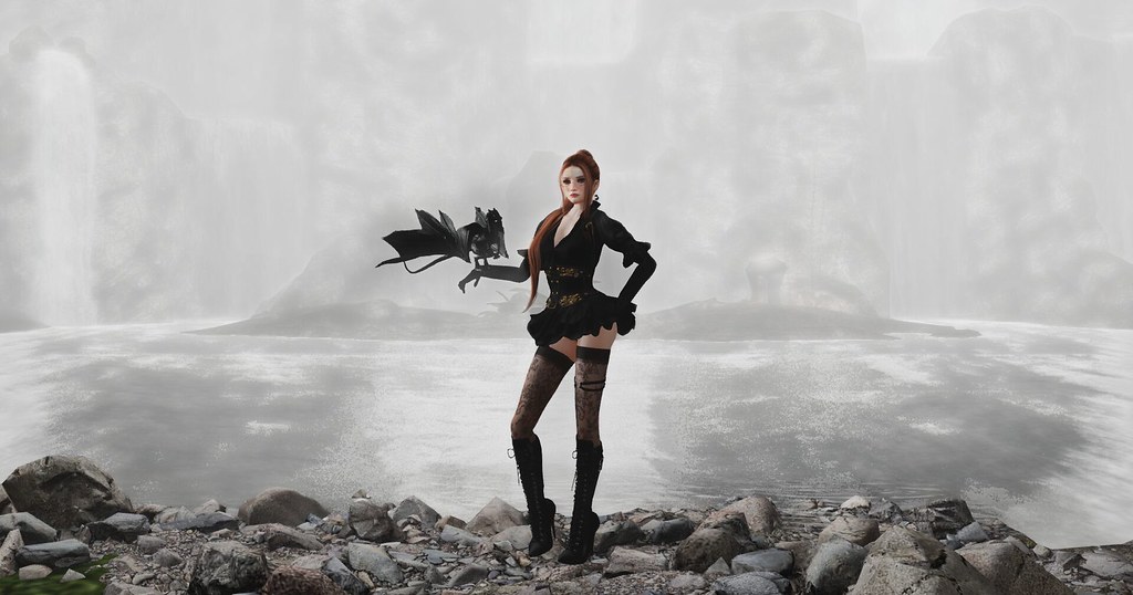
Waaaaaaaaaait a minute, that's no falcon (link)!
/edit: *facepalm* Yes imgur, a fully clothed picture is NSFW. For reference: It's not.
-
21
-
-
2 hours ago, Ceka Cianci said:
I believe a lot of games add them later, mainly to keep people playing the game.. Great news everyone, We've added Achievements, so now you can go out and reach your own personal goals and earn vanity items to show off to your friends.. hehehe
Funny enough, to my knowledge* any game releasing on either of the consoles is actually obligated to have a certain amount of achievements as part of the certification process.
No achievements? No release.
Although you're right that some keep adding more over time to have people come back.
* From residual knowledge and peeking through the docs for the process. I haven't found info for Nintendo so might be they allow you to release without them.
-
Generally, I am not that big a fan of angles but they quite work in your favour here, I feel. It adds to the dynamic pose and it balances out the - missing the english word for it, sorry, the part where the floor meets the wall. Wood border? Maybe? The frame too combines with the interesting shadow you've got in the background.
You've also added some brushstrokes, I guess to simulate some lens or old picture effect? It works here. I wouldn't know what else to edit. I would need to get super, super nitpicky for that. Which might work as an exercise in perfectionism but goes way beyond what's reasonable, I feel? It's a good picture!
-
2
-
1
-
-
1 hour ago, Shiloh Lyric said:
I use attached lights for photos sometimes, and have forgotten about them afterwards. 🫢
Gosh, I put a script reminder in mine that complains everytime I switch Sims and I still manage to forget they're attached.
But yah, I've recently had a few run ins with bad facelights when I was trying to take shots of others. Took me way too long to figure out that I wasn't messing up but rather that their nuclear sun overpowered every little subtle tweak I was making. In general I don't mind facelights on others but in general, a lot of those are just configured badly. There's no real reason they need to be omni-suns going bright white in all directions.-
1
-
-
Oh boy. Confession time: I need way too long for a picture.
I'm talking upwards of several hours for one. It starts with setting up outfits, adjusting poses, tweaking the lighting, scripting some particle effects if the shot calls for them. Once I somehow magically find the right picture, I take several shots, switch up lighting, take more shots - then switch composition just to reset my view and take even more shots. I try to avoid clipping with my pose and if I can't do that, I take picture with and without the offending attachment.
After all that, usually 3-4 hours, I head into post processing and work just as long there. Usually I further adjust lighting, contrast, paint over some parts. Sometimes I add little details if the shot calls for them. Maybe some hand painted hairstrands, perhaps a visual effect (I'm a sucker for shiny particle stuff), maybe a localized fake motion blur to suggest motion. Usually I'm adding some painted on lighting still.
It takes way too long
On 9/12/2023 at 10:07 PM, Marianne Little said:I think my unedited pictures look more real.
I think it's a pretty shot both before and after editing. However if I were to hazard a guess, I'd probably point at the blur being the culprit. It's not quite where I would expect to find it. For example: I would expect the body - as the main subject - to be in focus. However while parts of the face and bosom are in sharp focus, the belly has become blurred. The blur suggest depth or motion that is not otherwise conveyed, lending itself to a bit of a surreal result in my eyes. Just my guess - it's still a cool shot and I think overall the edits have added to the picture.
But I can also relate to the feeling of "this edit made it worse" when I look at my graveyard of deleted pictures that I never uploaded, because I got so entrenched in the edit that I began hating the result.
-
3
-
1
-
-
There's an interesting cultural dynamic at work. Swipe Culture (Tindr and such) has given some awful people, more precisely - some women, the power to be absolute jackasses on the internet. Friends have shown me the kind of replies they sometimes get and they're just plain abusive. There's no denying that it happens.
That perception, along with cherry-picked screenshots, in turn feeds into a culture that has got some very... peculiar views on women. They ain't exactly new. When I was a wee lass, I've heard grumbling from some men about how we only want the bad boys. The reality of the situation was that once teenage hormones had run their course, it wasn't the bad boys that walked away the winners. With none of my friends.
However, looping back to Tindr and Social Media in general, you've now got people that get stuck in that idea from their teenage years. Heck, I'm willing to bet a lot of them still are teenagers. They start building their prejudice, "women want this, women want that, that's unrealistic and unreasonable!" and then along comes some despicable goblin like Tate and feeds into it, along come social media echo chambers and keep feeding cherrypicked screenshots from Tindr, showing precisely how awful some people can be. This makes isolated incidents out to be a global societal problem instead of the isolated angst bull***** it is.
Thus, when I see these talking points brought up, they become a red flag. The deeper and more vehemently they are argued and presented as fact, the deeper the crimson of the flag.
There is a very simple dating advice wrapped up in this - my seemingly unreasonable and unrealistic expectation as a woman brought down to a simple summary:
- Treat me like an individual - not a prescribed identity.
That's the funny thing, all that's needed is to do less. Don't assume what the expectations are! Talk and figure them out. If some girl gives you hell for that, be thankful they self-flagged early. If they play some hard to get game, tell them "thanks, no thanks" and walk away. Saves time, saves you trouble and skips the teenage angst spiel. No seriously, they're doing you a service by showing their colors early. Also if they feel the need to put you down, block and move on.
Likewise, holding certain very strong opinions on women works like a self-flag too - just the other way around. I don't find many incels - I try to give everyone a fair chance. I don't think my standards are unreasonable:
- Don't be an ass.
- Don't put others down.
- Don't tell me how I am.
/edit: Obviously this is still linked to SL for me since the same applies to dating and flirting in SL. To translate:
- Don't be an ass (insult me in the third sentence)
- Don't put others down (if your opener is abuot some other girl using Kupra and your distaste for it - thanks for the self-flag!)
- Don't tell me how I am (if you tell me that as a woman I have got this or that expectation, I'm out)
-
6
-
5
-
34 minutes ago, Arielle Popstar said:
Okay. I always like to see where someone is coming from. Seeing your quotes there, I decided to have a look at your source because they're common talking points among certain... places.
First: The target audience of the article are lonely men. It plays on their emotions, incites them with dressed up talking points from Andrew Tate - just with less virulent rhetoric.
Second: The sell is a dubious dating website that is presented as the solution for their loneliness.
It's a product they're selling, not some sort of qualified statement on the nature of women and their expectations. While we're on the topic of expectations, a quick glimpse through the related articles is rather enlightening in itself.
- Can a Relationship Go Back to Normal After Cheating?
- How Couples Therapy Can Help After Infidelity
- 15 Proven Signs Your Partner Has Changed After Cheating
- 35 Proven Signs Your Wife or Girlfriend Slept With Someone
And then on page three it went full mask off with essentially conversion therapy. Sorry for not taking those claims about women's expectations at face value. They're oft cited, yet never proven when I go looking for the source. The website then is a full on grift praying on insecurities and political hot button topics, then peddling some funky affiliate link.
-
5
-
5
-
It's been a hot minute since I last encountered a professional athlete from the bagholder olympics. Let me check my notes, did I get my memo right? NFT and Crypto are going to take off any minute now and Elon Musky is going to send it to the moon, you only need to send him one bitcoin so he can send you back five - to an anonymous wallet of course. Don't say rug-pull, call it a fast moving market and the amount of high profile "hacked" wallets is purely a coincidence and besides, what happened to Sam Fried-Bankman was a deep state conspiracy by evil elites. Something like that?
At this point, any project involved with NFT and Crypto is poisoned by design. Those that bought into the grift have long lost their money and the remaining territories of people still willing to shift money into it has got to be abysmal at this point. NFT were a solution in search of a problem and the pipe-dream promises made about transferring assets between unaffiliated software never moved past the stage of "How in the bloody hell would you untangle the myriad copyrights all interwoven in this lawyer nightmare?".
With SL in particular, you can already export shapes and you can already sell shapes on the SL marketplace. All built-in and even there, you don't see people trying to shuffle shapes as some sort of investment strategy. I mean, some might but I don't think anyone is getting magically rich of it. In closing, NFT - No F****ing Thanks.
-
2
-
-
1 minute ago, Luna Bliss said:
Pet Peeve: why can't people get along? sigh
I think the answer is more or less: Hurt people hurt people. It takes conscious effort to break the cycle, easier to just keep going. This is especially true in times when we're all more or less running at more than full capacity.
-
6
-
-
Peeve: This weird dependency of the Second Life business side on Facebook of all things. Want to see what's on sale at an event? Facebook. Want to contact an organizer about a booth and inquire about fees? Facebook. Contacting a blogger for a flickr ad campaign?
Somehow... believe it or not, Facebook. Argh!
-
11
-
-
I'm a creature of comfort so my hopes are that it will be a neat way to kick back and relax away from my computer. Over the years I've tried a few solutions like streaming but it always stumbles at one point or another. On the flip-side, my biggest fear is that they will mark mobile users in some way. It's not like SL needs yet another reason for people to discriminate.
-
1
-
-
On 8/29/2023 at 5:57 AM, SabrinaCooke said:
BTW, I was going nuts trying to remember why your name sounded so familiar. You're the creator of the camera-based moveable lighting system I was coveting on the MP!
Shhh! You can't just go and unmask me!

https://www.flickr.com/photos/191119559@N02/53152053326/in/dateposted-public/
-
21
-


 We can already tell that we are going to need a strong backlight for this. Any object in the scene will have a strong light in the back, strong enough to cause a light halo around the trees. We can use that information in several places. For now, it informs us about where and how we want to light our avatar soon.

 And click Personal Lighting.

 The settings you want are at the bottom. Check [X] Light. Click the color and here you can set which colour the light will have. In the example, I have configured it to be the same type of light as we have in the image we want to put our avatar in. Since we will only be using an omni-light and not a projector, ignore FOV, Focus and Ambiance.

 In the Snapshot window, select the drop down menu with "Color" and select "Depth", then save this too. The reason we're saving the depth map as well is that you can do fancy things with it. In more complex scenes, you can actually use this to more finely control the depth of field effect via your editor. Our resident spring of sunshine,
 So why have we done all of these steps?
 The one to the left of "Transparency Mask" that's black and white? Good. Hold Control and click that. You will now see your avatar surrounded by the famous ant lines. That's the line that keeps moving around it - kind of like little ants. Create a new layer outside of the clipping group and while the selection is still active, select the fill tool, pick black as a color and fill selection. This gives you a completely black copy of your avatar. What good is that? Well, you can turn it, set the opacity quite a bit lower and would you look at that... a shadow.


 You can go and experiment a little. Remember, dark colours turn that part of the layer transparent and bright colours make it visible again. From here on out, we're good to go. The basic workflow in this step is to switch back and forth between the Background Layer and the attached Transparency Mask.


 Grab it. Top right, set the colour to black and then click any of the green areas.

 We definitely don't want that. Now some masochists might head out and handpaint every single strand and yah, sure you can do that. Or you can make it much easier on yourself. First. Make a new layer. Click the plus icon below the layer selection and you will get a Paint Layer. First, click this little α (alpha) icon on that layer so it looks like this:

 Color Picker
 Brush
Brush
 Good but still looks like the dog chewed it up. Don't fret, this is why we're doing non destructive editing here. Remember how we created the transparency mask earlier and how - repetition, wee - black is transparent and white is visible? The chewed up effect here is because the selection tool was a bit overzealous. So let's head back to the transparency mask and grab the brush, pick white and set it to a smaller size with an opacity of something like 40% then... get painting.


 Facebook
 Instagram
 Twitter
 YouTube
 Flickr
In the future, everyone will have their own event for fifteen minutes
in General Discussion Forum
Posted · Edited by ValKalAstra
We could have event days where the search actually works. That'd be like a whole sudden shopping event in itself. Can switch it on and off to give that dopamine rush. Petty snark aside:
I think it's a natural consequence of the marketplace being a bit of an advertisement black hole. Creators look for other ways to sell. Events bring in more people. Thus creators seek events. Events then become very selective about who they let in or are expensive to participate in. Thus the need for another event is born, restarting the cycle.
Personally I don't mind the quantity of events if they'd stick to a theme. Say an event about cute fashion probably shouldn't have beat up, bruised and abused, crying girls for ads and maybe a Science Fiction event could look into whether medieval clothing is a good fit.
Okay maybe I'm still a bit snarky. Yah the amount of events is getting a bit silly but I can kind of see why it happens. It's a symptom of another sickness, that of a lack of discoverability. So I doubt we need events for the marketplace (ain't lazy Sunday doing that, BTW?) but rather much improved discoverability.